How to read candlestick charts
Wondering what cryptocurrencies to buy, and when? When you research crypto assets, you may run into a special type of price graph called a candlestick chart. So it’s good to take a little time to learn how these work.
Similar to more familiar line and bar graphs, candlesticks show time across the horizontal axis, and price data on the vertical axis. But unlike simpler graphs, candlesticks have more information. In one glance, you can see the highest and lowest price that an asset hit during a given timeframe — as well as its opening and closing prices.
What are candlestick charts?
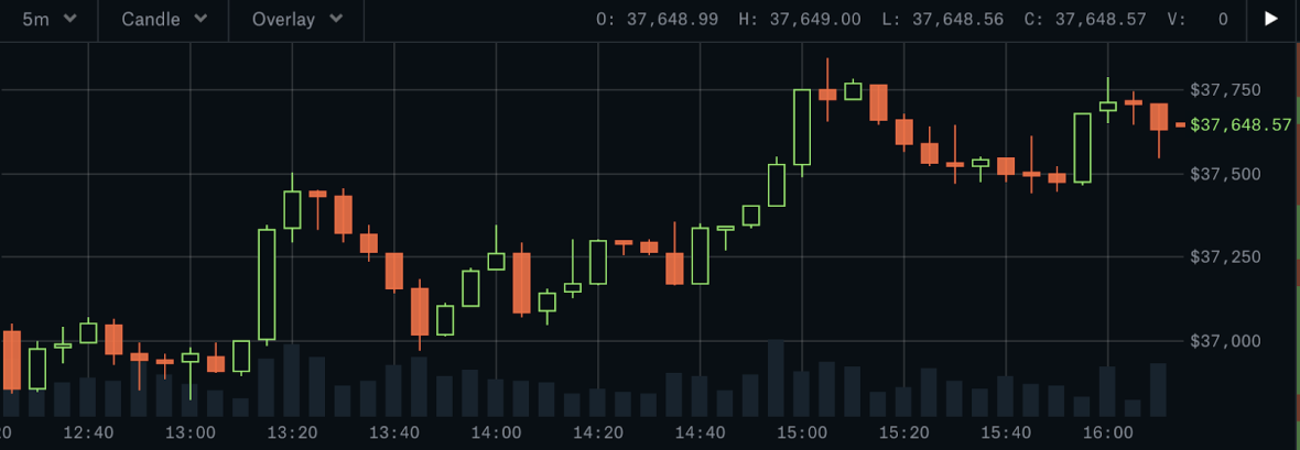
Here’s an example of an actual Bitcoin-USD candlestick chart from Coinbase Pro:

Candlesticks give you an instant snapshot of whether a market’s price movement was positive or negative, and to what degree. The timeframe represented in a candlestick can vary widely. Coinbase Pro, for instance, defaults to six hours — with each candle representing a five-minute slice — but users can set it to be longer or shorter. (Also worth noting: unlike stock markets, crypto markets are open 24 hours a day. So the “open” and “close” prices are the prices at the beginning and end of the selected timeframe.)

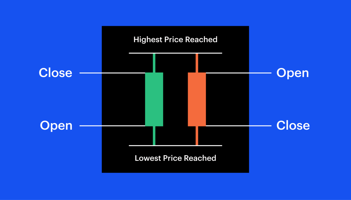
Green candles show prices going up, so the open is at the bottom of the body and the close is at the top. Red candles show prices declining, so the open is at the top of the body and close is at the bottom.
Each candle consists of the body and the wicks. The body of the candle tells you what the open and close prices were during the candle’s time frame.
The lines stretching from the top and bottom of the body are the wicks. These represent the highest and lowest prices the asset hit during the trading frame.
What do candlesticks tell us?
Candlesticks can reveal much more than just price movement over time. Experienced traders look for patterns in order to gauge market sentiment and to make predictions about where the market might be headed next. Here are some of the kinds of things they’re looking for:
A long wick on the bottom of a candle, for instance, might mean that traders are buying into an asset as prices fall, which may be a good indicator that the asset is on its way up.
A long wick at the top of a candle, however, could suggest that traders are looking to take profits — signaling a large potential sell-off in the near future.
If the body occupies almost all of the candle, with very short wicks (or no visible wicks) on either side, that might indicate a strongly bullish sentiment (on a green candle) or strongly bearish sentiment (on a red candle).
Understanding what candlesticks might mean in the context of a particular asset or within certain market conditions is one element of a trading strategy called technical analysis — by which investors attempt to use past price movements to identify trends and potential future opportunities.
How to read “one-candle signals”
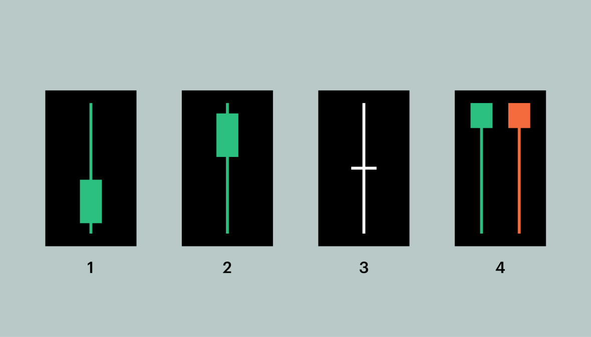
Traders operating in really short time frames sometimes focus on just one candle. Familiarizing yourself with these “one-candle signals” can be a helpful exercise as a beginner. In the image below, you’ll find four common one-candle signals:

A long upper shadow could be an indicator of a bearish trend, meaning that investors are looking to sell and take profit. The longer the upper shadow, the stronger an indicator.
A long lower shadow could be a bullish signal, indicating that investors are looking to buy, thus driving prices up. The longer the lower shadow, the more reliable the signal.
A Doji candle has no body, because the open and close prices are the same. These can typically be interpreted to mean there is indecision in the market, and are a possible indicator for an upcoming price reversal. (Why “doji”? Candlestick charts were first used by Japanese rice traders in the 18th century. “Doji” means error — presumably because it would be uncommon for prices to open and close in the exact same place. )
Umbrellas have a distinctively long bottom wick. A red umbrella is also known as a hammer. When you see a hammer it often means that the asset is receiving some serious buy action — and the price might soon be on its way up. Green umbrellas, on the other hand, have an ominous nickname: hanging men. They’re often a signal that sellers are ready to cash out — reversing the up cycle.
It’s important to note that one-candle signals can be an important clue, but an accurate reading of the market requires understanding the broader context. And spotting trends and patterns in candlestick charts isn’t easy. If you’re not sure what investment strategy is right for you, check with a professional advisor.


